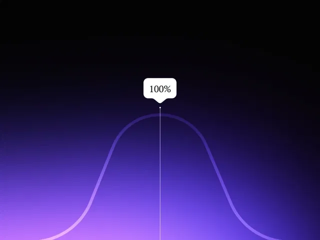
Hover-triggered tooltip that appears with fade and slight scale animation
Smart positioning (auto-flips above/below/left/right based on space)
Fully customizable content, typography, background, border, shadow, and arrow pointer
Reusable component structure for easy placement anywhere on your site
Responsive behavior—toolips adapt to mobile (tap instead of hover)
Native Framer tools (variants, interactions, absolute positioning, overflow handling) for no-code build
Narrated video with live canvas demo, variant setup, hover interaction, and real-time testing
#What is This Course?
"Tooltip" is a free video tutorial on the Framer Marketplace, created by a practical designer/educator (community contributor). This framer resource concise, beginner-to-intermediate video shows exactly how to build a modern tooltip component from scratch—quickly and without code. Delivered through narrated screen recordings with live canvas construction, zooms on variants panel, interactions tab, positioning controls, and real-time hover previews, it covers creating the trigger element, building the tooltip popup, setting up hover show/hide, adding fade/scale animations, smart placement logic, and styling for brand match. Video length is likely 6–12 minutes (typical for Marketplace quick UI tutorials), with clear pacing and pause-friendly steps for instant replication. No duplicatable project is explicitly noted in listings, but the tutorial is designed for direct building in your own Framer canvas or template. It’s especially valuable for designer-developers who want to improve UX clarity—adding helpful micro-interactions to icons, form labels, buttons, nav items, or any element needing extra context without cluttering the design.
#What You’ll Learn ⚡
Building a reusable tooltip trigger + popup component structure
Using hover interactions to show/hide the tooltip with smooth fade-in/scale animation
Positioning the tooltip intelligently (above/below, left/right auto-flip) with absolute layout
Adding optional arrow pointers, shadows, borders, and brand-matched styling
Creating variants for different tooltip states (visible/hidden, position variants)
Testing hover behavior and mobile tap fallback for full responsiveness
#Who Is This For?
This video tutorial is perfect for Framer users who want to add helpful, non-intrusive context—ideal if your buttons, icons, or fields need extra explanation without permanent labels.
Skill Level: Beginner to intermediate—great even with basic components
Prior Knowledge Needed: Comfort with Framer variants, interactions, and absolute positioning
Use Case 1: Adding explanatory tooltips to form inputs, settings toggles, or unfamiliar icons
Use Case 2: Enhancing navigation items, feature cards, or dashboard elements with hover hints
Pain Point Solved: Users confused by icons/buttons—provide instant context on hover
Pain Point Solved: Tooltips hard to position cleanly—learn smart auto-placement logic
Bonus Fit: Designers building SaaS dashboards, documentation sites, or any UI-heavy project
#Course Structure Breakdown
This video tutorial flows as a short, focused build-along—narrated screen recording with canvas zooms, variants panel focus, interaction triggers, positioning tweaks, and real-time hover testing for easy pausing/replication.
Intro / Recap / Problem Statement: Hooks with why tooltips improve UX (clarity without clutter), explains simplicity of no-code approach, and previews the final effect
Main Demo Sections: Create trigger element (icon/button), build tooltip popup frame, set up hover show/hide interaction
Key Live Examples or Walkthroughs: Add fade/scale animation via variants, configure smart positioning (above/below flip), style with shadows/borders/arrow
Tips / Best Practices: Use delay on show for natural feel, test edge cases (near screen edges), ensure mobile tap support, keep content concise, match brand colors
Wrap-up / Encouragement: Shows final tooltip working on hover across page, celebrates clean helpfulness, and encourages placing it throughout your design
Frequently Asked Questions
How does the tooltip know where to appear (above/below)?
Use Framer’s built-in positioning logic or simple variants based on trigger location—tutorial shows auto-flip technique for edge cases.
Can I make tooltips appear on click instead of hover?
Yes—swap hover trigger for click; video likely covers both options and toggle behavior.
Will tooltips work well on mobile/touch devices?
Yes—Framer converts hover to tap; tutorial demonstrates tap-to-show and tap-away or timeout close.
Tooltip
Add elegant, contextual tooltips to your Framer site in minutes
Resource Types :
Featured Framer Resources
Add Featured Product


Have a product?
Submit your Framer product to AllFramer, get featured, and drive genuine traffic while showcasing your work to the world. Turn your creativity into revenue and begin selling today! 🚀
Submit Resource