Practical setup of fluid typography using Framer variables + clamp() for smooth scaling between min/max sizes
Use of viewport units (vw, vh) combined with rem/em for consistent, context-aware sizing
Breakpoint-aware adjustments without duplicating styles—centralized control via variables
Real-page examples showing before/after responsive behavior on different devices
Text-based tutorial with clear steps, formula examples, and Framer-specific tips for clean implementation
#What is This Course?
"Responsive Type" is a free, text-based tutorial on the Framer Marketplace, created by an expert contributor (author not explicitly named in public listings, often community-driven). This Framer resource addresses one of the most common frustrations in Framer: text that looks great on desktop but becomes too small, too large, or unbalanced on mobile/tablet. The guide teaches a modern, scalable approach using variables, the clamp() function, viewport units, and strategic breakpoints to create typography that automatically adjusts fluidly. Structured as a practical article with formulas, step-by-step instructions, and visual references (implied screenshots), it leverages Framer's text properties, variables panel, and responsive canvas. No video runtime or duplicatable project is explicitly noted, but the methods are easy to apply directly in any Framer project or template. It's invaluable for designer-developers who want professional-grade responsiveness—saving hours of manual tweaking and delivering sites that feel premium across all screens.
#What You’ll Learn ⚡
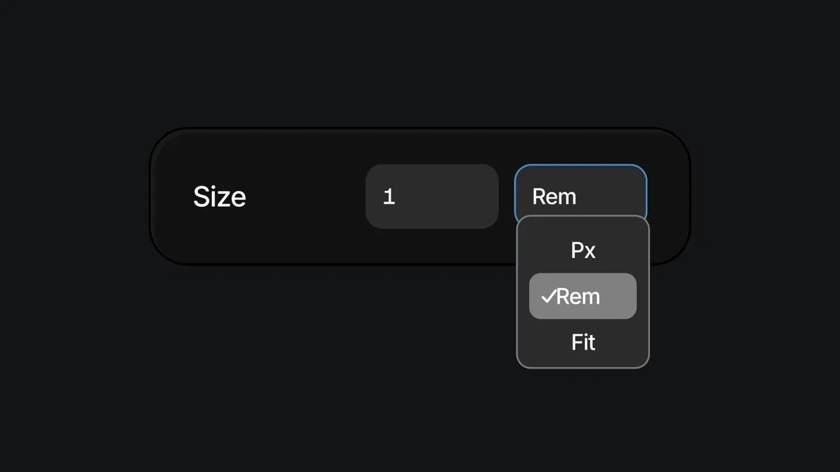
Defining a fluid type scale with variables and clamp() to set minimum, preferred, and maximum font sizes
Combining viewport units (vw) with rem/em for scalable typography that respects root font size
Setting up responsive typography variables that adapt automatically across breakpoints
Testing and refining type behavior in Framer's device previews for balanced readability
Applying the system to headings, body text, buttons, and UI elements for consistent scaling
#Who Is This For?
This tutorial is perfect for Framer users tired of fighting typography at every breakpoint—ideal if your text looks off on mobile or you want a single source of truth for type.
Skill Level: Beginner to intermediate—accessible once you know basic text styling
Prior Knowledge Needed: Comfort with Framer text elements, properties panel, and variables (or willingness to learn them quickly)
Use Case 1: Building responsive landing pages, portfolios, or marketing sites where typography must shine on all devices
Use Case 2: Customizing templates that look great on desktop but need mobile love
Pain Point Solved: Manual font-size tweaks per breakpoint—create one fluid system instead
Pain Point Solved: Tiny text on phones or oversized headlines on tablets—clamp() + variables fix scaling automatically
Bonus Fit: Designers following modern web trends (fluid typography) who want Framer-native implementation
#Course Structure Breakdown
This text-based tutorial flows as a logical, step-by-step guide—easy to follow while in Framer's variables and text panels, with an intro on why fluid type matters and clear formulas.
Intro / Recap / Problem Statement: Explains the responsive typography challenge (fixed sizes break across viewports), introduces fluid type as the modern solution, and previews clamp()/variables
Main Demo Sections: Core setup: create typography variables (e.g., --heading-1, --body), apply clamp(min, vw-based preferred, max) for fluid sizing
Key Live Examples or Walkthroughs: Shows applying variables to text layers, testing in device previews (mobile → desktop), and adjusting min/max values for balance
Tips / Best Practices: Highlights key settings (root font size, viewport units, breakpoint fallbacks), common formulas (e.g., clamp(1.5rem, 4vw + 0.5rem, 3rem)), and performance notes
Wrap-up / Encouragement: Demonstrates final responsive behavior across screens, reinforces time savings and polish, and encourages building your own type scale
Frequently Asked Questions
What is clamp() and why use it for responsive type?
clamp() sets a fluid value between min and max, scaling smoothly with viewport—e.g., clamp(1.25rem, 3vw + 0.5rem, 2.5rem)—it prevents text from becoming too small or large automatically.
Do I need advanced math or code knowledge?
No—the tutorial provides ready-to-copy formulas; you just paste into Framer variables and tweak min/max/preferred values.
How do I make sure the type stays readable on very small/large screens?
Set sensible min/max in clamp() (e.g., min 1rem, max 4rem), test on extreme breakpoints, and use rem for accessibility—the guide covers these checks.
Responsive Type
Make your typography adapt beautifully across every device
Resource Types :
Featured Framer Resources
Add Featured Product


Have a product?
Submit your Framer product to AllFramer, get featured, and drive genuine traffic while showcasing your work to the world. Turn your creativity into revenue and begin selling today! 🚀
Submit Resource