Deep dive into Stacks (horizontal/vertical direction, gap, padding, content distribution, alignment)
Introduction to Grids (rows, columns, gaps, item placement) for structured, repeatable layouts
Practical use of flexible sizing units (%, fit-content, fill, auto) vs. fixed px for responsiveness
Real examples of common layout patterns (hero sections, cards, navbars, footers) using templates
Text-based tutorial with clear steps, visual references, and Framer-specific controls for immediate application
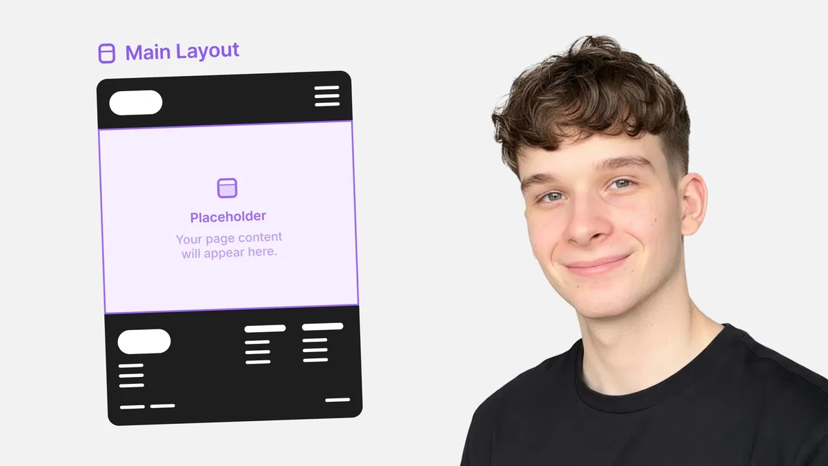
#What is This Course?
"Layout Templates" is a free, text-based tutorial on the Framer Marketplace, created by Adam Sebesta (@adam-sebesta) as #5 in the "How to Use Framer Templates" series. This framer resource focuses on Framer's layout system—teaching how to use Stacks and Grids as the foundation for responsive, scalable page designs. The guide explains why layout templates matter (consistency, speed, adaptability), then covers core tools: Stack direction/gap/padding/distribution/alignment, Grid setup (rows/columns), flexible units, and best practices for real-world patterns. Structured as a practical article with definitions, examples, and tips, it uses Framer's right panel layout controls and canvas for no-code mastery. No video runtime or duplicatable project is explicitly noted (series often pairs with template starters), but it's designed for direct use in any Framer template or blank project. It's invaluable for designer-developers customizing templates or building custom sites—replacing rigid layouts with smart, device-friendly structures that save time and look polished everywhere.
#What You’ll Learn ⚡
Creating and configuring Stacks (horizontal/vertical) with gap, padding, distribution (space-between, space-around), and alignment
Setting up Grids with defined rows/columns, gaps, and item placement for structured content
Choosing responsive sizing units (%, fit-content, fill, auto) over fixed px to prevent overflow/breakage
Applying layout templates to common patterns (hero, cards, nav, footer) with real-page examples
Testing and refining layouts across breakpoints using device previews for true responsiveness
#Who Is This For?
This tutorial is perfect for Framer users struggling with layout chaos—ideal if your designs break on mobile or feel stiff and manual.
Skill Level: Beginner to intermediate—starts from layout basics
Prior Knowledge Needed: Comfort with adding frames/elements and basic editing (covered in earlier series parts)
Use Case 1: Customizing Marketplace templates with adaptive sections that work on all devices
Use Case 2: Building custom pages (landing, portfolio, blog) with clean, scalable structure
Pain Point Solved: Fixed px causing overflow on phones—switch to flexible units and Stacks/Grids
Pain Point Solved: Inconsistent spacing/alignment—use gap, distribution, and alignment controls
Bonus Fit: Anyone in Adam Sebesta's "How to Use Framer Templates" series progressing toward responsive mastery
#Course Structure Breakdown
This text-based tutorial flows as a logical, practical guide—easy to follow with Framer open, starting with layout importance and moving through tools and patterns.
Intro / Recap / Problem Statement: Explains why good layout foundations matter (responsiveness, maintainability), recaps series progress, and introduces Stacks/Grids as Framer's layout power tools
Main Demo Sections: Core Stacks: direction (horizontal/vertical), gap/padding, distribution (space-between/around/evenly), alignment (top/center/bottom/stretch)
Key Live Examples or Walkthroughs: Grids (rows/columns, gaps, placement), flexible units (%, fit-content/fill/auto vs. px), and real patterns (hero with centered content, card grid, navbar)
Tips / Best Practices: Use gap over margins, prefer relative units, test on breakpoints, nest Stacks/Grids smartly—includes pro advice throughout
Wrap-up / Encouragement: Reinforces how layout templates make designs future-proof—encourages building a sample page and continuing the series
Frequently Asked Questions
What's the difference between Stack and Grid in Framer?
Stack is linear (horizontal/vertical flow with gap/alignment); Grid is 2D (rows/columns for structured placement)—tutorial explains when to use each.
Why avoid fixed px for sizing?
Px doesn't scale with viewport—use %, fit-content, fill, or auto for elements that adapt; guide shows how px causes mobile breakage.
How do I make content center perfectly in a Stack?
Set alignment to center (both axes if needed), use distribution space-around/evenly, or wrap in another Stack—examples provided.
Featured Framer Resources
Add Featured Product


Have a product?
Submit your Framer product to AllFramer, get featured, and drive genuine traffic while showcasing your work to the world. Turn your creativity into revenue and begin selling today! 🚀
Submit Resource