Breakpoints enable adaptive design: desktop parent cascades to tablet/mobile unless overridden.
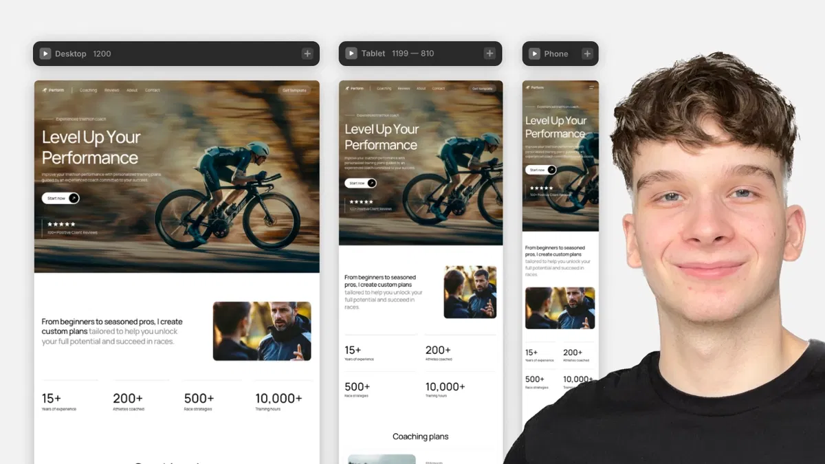
Common Framer breakpoints: 1200 px (desktop), 810 px (tablet), 390 px (mobile) — auto-activated by screen width.
Overrides are local: tablet changes don't affect desktop or mobile unless specifically set.
Reset overrides via blue properties in right panel for quick fixes.
Essential for accessibility/readability: adjust spacing, fonts, remove hovers, stack elements on smaller screens.
No-code focus: Framer handles switching and inheritance — users just tweak visuals per breakpoint.
#What is This Framer Blog?
This is a free, practical Framer resource titled "Framer Breakpoints" (part of the "How to Use Framer Templates" series, #2) on the Framer Marketplace, created by Adam Sebesta. It explains how breakpoints work in Framer and shows how to use them to customize templates responsively across different screen sizes. The tutorial emphasizes making designs adapt automatically for desktop, tablet, and mobile without code—focusing on inheritance, overrides, and best practices for professional, readable, accessible sites. Short and visual (with a duplicatable project link), it's designed for quick learning, likely 5–10 minutes reading time, building on Framer's no-code responsive tools.
#What You’ll Learn ⚡
What breakpoints are and why they're essential for responsive design (adapting layouts, fonts, spacing, images, interactions for different devices).
Framer's default/common breakpoints: 1200 px (desktop), 810 px (tablet), 390 px (mobile) — how Framer auto-switches views based on window/screen width.
Desktop as the "parent" breakpoint: changes made here cascade to smaller sizes unless overridden.
How to override styles specifically for tablet or mobile (e.g., stack elements vertically, swap images, adjust font sizes, remove hover effects).
Reverting overrides easily: overridden properties appear blue in the right panel—click to reset to desktop inheritance.
Best practices for full responsiveness: test across breakpoints, prioritize mobile readability/accessibility, and edit templates confidently.
#Who Is This For?
This tutorial is ideal for:
Beginners and intermediate Framer users working with templates who need to make sites look great on phones, tablets, and desktops.
Designers remixing Marketplace templates and wanting to customize responsiveness without breaking layouts.
Anyone new to responsive design in Framer who wants to understand inheritance, overrides, and device-specific tweaks.
Freelancers or creators building client sites who must ensure professional, accessible experiences across devices.
Users following the "How to Use Framer Templates" series or transitioning from static designs to truly adaptive ones.
It's especially helpful if you've duplicated a template but struggled with mobile/tablet views looking off.
#Blog Brief Breakdown
The tutorial is concise, visual, and step-by-step with screenshots, a duplicatable project, and clear explanations:
Introduction — Explains breakpoints' purpose: automatic adaptation for screen sizes (e.g., vertical stacking on mobile, larger fonts on desktop, image swaps, removing hover on touch devices).
How Breakpoints Work in Framer — Covers common sizes (1200 px desktop, 810 px tablet, 390 px mobile); Framer switches views automatically; desktop is parent—edits apply downward unless overridden.
Overriding Styles — Demo of editing in tablet/mobile views: change layouts, fonts, spacing, images; overrides affect only that breakpoint.
Reverting Changes — Blue-highlighted properties in right panel show overrides—click to reset to desktop defaults.
Wrap-up & Tips — Stresses ease once understood; makes template editing fast and professional; teases next tutorial on content editing.
Hands-on — Link to duplicate project for practice.
No code overrides needed — purely visual Framer interface, properties panel, and breakpoint toggles.
Frequently Asked Questions
What are breakpoints in Framer?
They define how your design adapts at specific screen widths (e.g., desktop >1200 px, tablet 810 px, mobile <390 px) for automatic responsive switching.
Why is desktop the parent breakpoint?
Changes on desktop inherit to smaller sizes by default — making it efficient to design once and override only where needed.
How do I know a style is overridden?
Overridden properties turn blue in the right properties panel — click to revert to desktop inheritance.
Framer Breakpoints
Free Framer tutorial explaining breakpoints, inheritance, and override
Resource Types :


Have a product?
Submit your Framer product to AllFramer, get featured, and drive genuine traffic while showcasing your work to the world. Turn your creativity into revenue and begin selling today! 🚀
Submit Resource