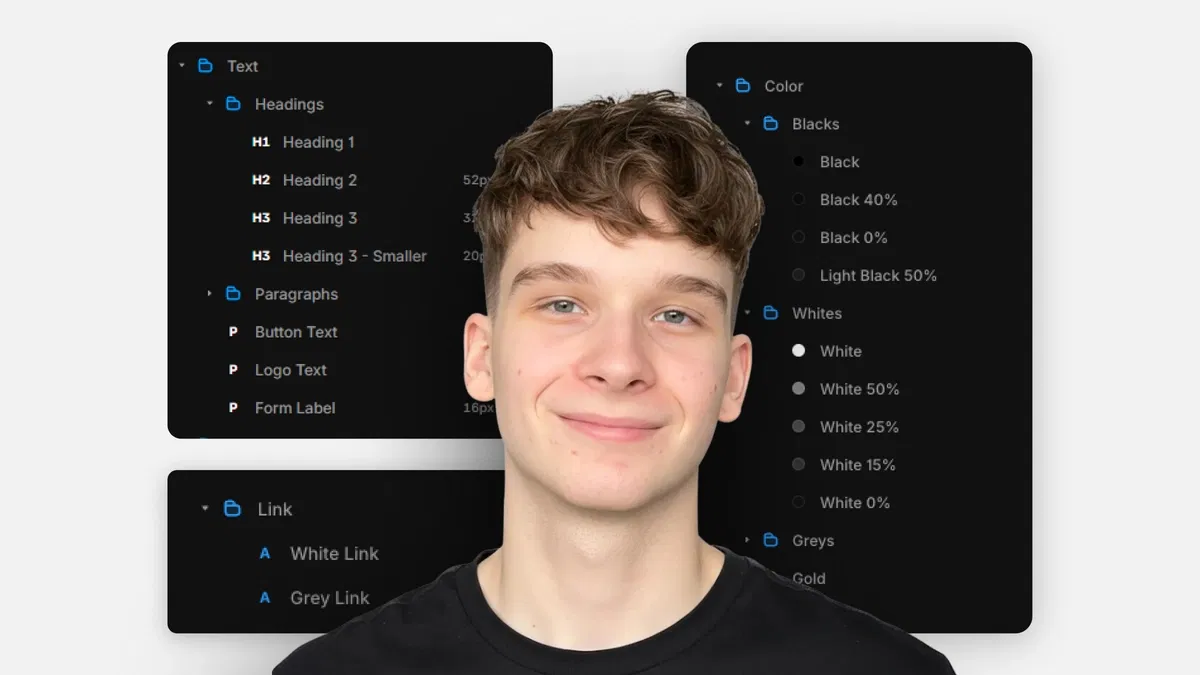
Centralized control with text styles (headings, body, supporting), link styles (states: default/hover/active/visited), and color styles (brand palettes, backgrounds, borders)
Practical benefits: one-change updates for site-wide consistency, easier light/dark modes, and faster customization
Layout & sizing best practices: flexible units (%, fit-content, fill) over fixed px, Stacks (direction, gap, padding, distribution), grids (rows/columns/gaps)
Framer-native tools: Assets panel for styles, right panel for editing/assignment, layout controls for responsive structure
Text-based guide with screenshots, examples, and tips for clean, professional results
#What is This Course?
"Design Styles" is a free, text-based tutorial (21m reading time) on the Framer Marketplace, created by Adam Sebesta. This framer resource teaches how to leverage Framer's design styles for efficient, consistent updates—addressing the pain of changing every element manually in templates or projects. The guide explains text styles (H1-H3 hierarchy, body, supporting), link styles (color/states), color styles (reusable palettes), then covers layout/sizing without styles (units, Stacks, grids) for responsive foundations. Structured as a practical article with definitions, examples, and tips, it uses Framer's Assets panel, right properties, and layout controls for no-code mastery. No video runtime or duplicatable project is explicitly noted (series often pairs with templates), but it's designed for direct application in any Framer template or project. It's invaluable for designer-developers customizing templates or building scalable sites—turning "one-off" edits into global, maintainable design systems with speed and consistency.
#What You’ll Learn ⚡
Creating and applying text styles (headings H1-H3, body, supporting text) in Assets panel for site-wide typography control
Setting up link styles with default/hover/active/visited states for consistent interactive text behavior
Defining and using color styles for brand palettes, backgrounds, buttons, borders—enabling one-click theme changes
Choosing flexible sizing units (%, fit-content, fill) over fixed px for responsive layouts
Building layouts with Stacks (direction, gap, padding, distribution) and grids (rows/columns/gaps) for clean spacing/structure
#Who Is This For?
This tutorial is perfect for Framer users ready to move beyond manual edits—ideal if changing colors or fonts feels tedious or you're customizing templates.
Skill Level: Beginner—assumes basic editing knowledge but starts from style basics
Prior Knowledge Needed: Comfort with Framer canvas, text/images, and properties panel (covered in earlier series parts)
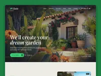
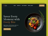
Use Case 1: Customizing Marketplace templates with your brand colors, typography, and layout tweaks
Use Case 2: Building or maintaining sites where design updates need to happen quickly and consistently
Pain Point Solved: Site-wide changes taking forever—use styles for instant global updates
Pain Point Solved: Inconsistent spacing or scaling—master flexible units, Stacks, and grids
Bonus Fit: Anyone in Adam Sebesta's "How to Use Framer Templates" series progressing toward pro-level customization
#Course Structure Breakdown
This 21m text tutorial flows as a logical, educational guide—easy to follow with Framer open, starting with styles overview and moving to layout techniques.
Intro / Recap / Problem Statement: Introduces design styles as the key to efficient updates, explains benefits (consistency, speed), and outlines coverage (text/link/color styles + layout basics)
Main Demo Sections: Text styles (definition, common types H1-H3/body, creating/editing in Assets/right panel); Link styles (properties, states hover/active/visited)
Key Live Examples or Walkthroughs: Color styles (creating palettes, assigning to elements, brand/light-dark use); Layout/sizing without styles (units %, fit-content/fill, Stacks direction/gap/padding/distribution, grids rows/columns/gaps)
Tips / Best Practices: One H1 per page, flexible units over px, gap vs. margins for spacing, color styles for themes—includes pro tips throughout
Wrap-up / Encouragement: Reinforces how styles + smart layout make customization fast and maintainable—encourages applying to your template and continuing the series
Frequently Asked Questions
Why use design styles instead of editing elements directly?
Styles let you update once (e.g., brand color change) and affect everywhere—saves time, ensures consistency, and simplifies maintenance.
How many text styles should I create?
Keep it simple: H1 (main title), H2 (sections), H3 (sub-sections), Body (paragraphs), Supporting (small text)—tutorial recommends this structure.
Can styles help with light/dark mode?
Yes—color styles make switching palettes easy (assign light/dark variants); guide highlights this use case.
Design Styles
Update your entire Framer site's look from one central place
Resource Types :
Featured Framer Resources
Add Featured Product


Have a product?
Submit your Framer product to AllFramer, get featured, and drive genuine traffic while showcasing your work to the world. Turn your creativity into revenue and begin selling today! 🚀
Submit Resource