Free interactive theme switch button for Framer
Supports Light, Dark, and System modes
Saves user preference using localStorage
Includes animated visual effects during switching
Fully customizable size, colors, and styling
#What is Product?
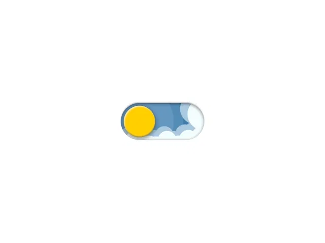
Theme Switch is a free Framer component designed as an interactive button that allows users to switch between light, dark, and system themes. Built using React and native Framer capabilities, it combines UI interaction with theme management logic. With smooth transitions, visual effects, and persistent user preferences, it provides a complete solution for adding dynamic theming directly through a button interface in modern websites and applications.
#Features ⚡
Theme toggle button: Switch between Light, Dark, and System modes
System theme detection: Automatically adapts to OS-level preferences
Persistent state: Saves selected theme using localStorage
Animated effects: Particle, cloud, and star effects during transitions
Smooth transitions: Clean and modern switching animations
Custom styling: Adjust size, colors, and optional shadow
Global theme updates: Applies changes across the entire project
Accessible interaction: Built with label/input for accessibility
#Included Components/Templates
Descriptive list of main components, blocks, templates, plugin the product ships with.
Theme Switch button component
Light, Dark, and System mode switching logic
Visual transition effects (particles, clouds, stars)
Custom CSS token updates for themes
Global theme sync across pages
#Pricing 💸
Free to use
No paid tiers mentioned
#Integrations 🧰
Framer marketplace ecosystem
React-based theming system
Works across pages, layouts, and apps in Framer
Uses localStorage for saving preferences
Frequently Asked Questions
What modes are supported?
It supports Light, Dark, and System modes.
Does it detect system theme automatically?
Yes, it listens to system settings and updates accordingly.
Are user preferences saved?
Yes, it stores the selected theme in localStorage.
Featured Framer Resources
Add Featured Product


Have a product?
Submit your Framer product to AllFramer, get featured, and drive genuine traffic while showcasing your work to the world. Turn your creativity into revenue and begin selling today! 🚀
Submit Resource