Dual-panel side-by-side layout
Smooth sliding transitions
Ideal for comparisons or feature highlights
Fully responsive across devices
Native Framer component
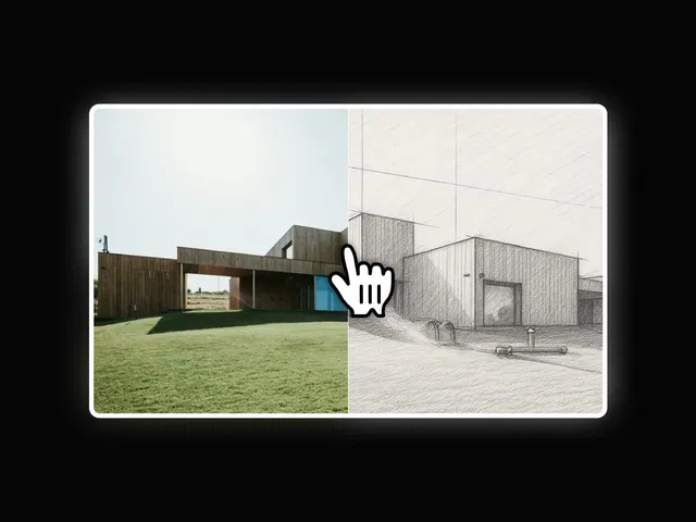
#What is Side by Side Slide?
Side by Side Slide is a premium Framer component that lets you present content in a split, dual-panel slider format. Instead of traditional single-card sliders, this layout places two sections next to each other — making it perfect for comparisons, before/after showcases, feature breakdowns, or product highlights.
Built specifically for Framer, it integrates seamlessly into your Framer project and leverages native layout and animation capabilities.
#Features ⚡
Dual Content Panels: Display two sections simultaneously.
Smooth Slide Transitions: Elegant horizontal animations.
Comparison-Friendly Layout: Great for feature vs feature or before/after use cases.
Customizable Styling: Adjust spacing, typography, and layout alignment.
Responsive Ready: Automatically adapts across desktop, tablet, and mobile.
Clean Structure: Easy-to-edit layers and properties panel.
#Included Components/Templates
This component includes:
Split-panel container setup
Pre-configured sliding interaction
Responsive breakpoint configuration
Editable property controls
Support for text, images, or mixed content
It enhances feature or comparison sections rather than providing complete page templates.
#Pricing 💸
Free to use
No recurring subscription
Refer to the official marketplace listing for current pricing and license details.
#Integrations 🧰
Native Framer animation engine
Compatible with Framer CMS collections
Works with images, text blocks, and custom layouts
Supports responsive design
Can be combined with other interactive Framer components
Frequently Asked Questions
Can I use it for product comparisons?
Yes. It’s ideal for showcasing differences side by side.
Is it mobile-friendly?
Yes. The layout adjusts for smaller screens automatically.
Can I customize panel widths?
Yes. Spacing and layout proportions can be modified.
Side By Side Slide
Interactive side-by-side sliding content component
Resource Types :

Have a product?
Submit your Framer product to AllFramer, get featured, and drive genuine traffic while showcasing your work to the world. Turn your creativity into revenue and begin selling today! 🚀
Submit Resource