Smooth icon slide-in animation on hover
Perfect for modern CTAs and hero sections
Customizable motion direction and speed
Clean, minimal, and responsive design
Built natively for Framer
#What is Icon Slide-In Button?
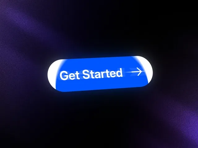
Icon Slide-In Button is a dynamic Framer component that enhances standard call-to-action buttons with a smooth, animated icon reveal. When users hover over the button, the icon slides into view — creating a subtle but high-impact micro-interaction that makes your UI feel more polished and engaging.
It’s ideal for SaaS landing pages, product launches, portfolio sites, and marketing sections where attention-grabbing CTAs matter. Built specifically for Framer, it integrates seamlessly with layouts, breakpoints, and motion controls — eliminating the need for custom animation setups.
#Features ⚡
Slide-In Icon Animation: Icon smoothly moves into position on hover.
Direction Control: Adjust animation direction (left, right, etc.).
Customizable Speed: Fine-tune transition timing and easing.
Flexible Content Layout: Combine text, icons, and spacing controls easily.
Hover & Active States: Clean interaction feedback for better UX clarity.
Fully Responsive: Works across desktop, tablet, and mobile breakpoints.
Lightweight Implementation: Smooth animations without performance overhead.
#Included Components
The package typically includes:
Button base component
Slide-in icon element
Animation timing controls
Direction configuration options
Hover and active state styling
Responsive layout settings
Everything is structured for drag-and-drop usage directly inside your Framer project.
#Pricing 💸
Absolutely free
Lifetime usage license
Creator-provided updates (as per marketplace terms)
Refer to the official marketplace page for current pricing details.
#Integrations 🧰
Framer layout and stack system
Framer motion and interaction controls
Compatible with hero sections and CTA blocks
Works alongside other interactive UI components
Frequently Asked Questions
Can I change the slide direction of the icon?
Yes. The animation direction can be configured within the component controls.
Is the animation customizable?
Yes. You can adjust timing, easing, and hover behavior.
Can I use different icons?
Yes. You can replace the icon with any supported icon or graphic.
Icon Slide In Button
Hover-triggered sliding icon CTA button
Resource Types :

Have a product?
Submit your Framer product to AllFramer, get featured, and drive genuine traffic while showcasing your work to the world. Turn your creativity into revenue and begin selling today! 🚀
Submit Resource